Using dialogs to interact with the user
You can use dialogs to display controls to the user, and just with dialogs in Windows and other operating systems, they can be closed by tapping the close (X) button in the top corner.
The dialogs also support help via the help button in the same way as pages on a Kiosk2Go device. For more information, see Adding context sensitive help to a Kiosk2Go control.
Note: Currently, you cannot drag a dialog to reposition it.
To add a dialog to your design
- In the device tree, expand the Graphic Elements & Blocks / Kiosk2Go Layouts folder.
- Drag a K2G Dialog device over to the design page.
The Kiosk2GoDlg Layout Properties dialog box is displayed.
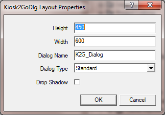
- If you want to change the dimensions of the dialog, type the new values into the Height and Width boxes.
- If you want to change the name of the dialog, type a new name in the Dialog Name box.
Note: Each dialog must have a unique name.
- In the Dialog Type box, click an option to specify the visual style of the dialog.
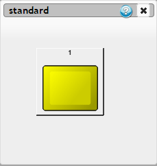
Standard
|
Dialog with titlebar, help button and close button.
|
No Titlebar
|
Dialog with help button and close button, but no title bar.
|
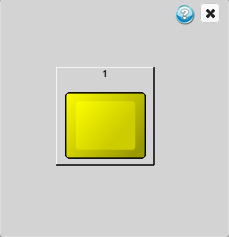
Empty Frame
|
Dialog with controls only. No titlebar, help button, close button or border are shown. (A dotted border is shown in the example to illustrate that the dialog size has not changed.)
Notes:
- If a background image is added to the dialog in NWare, it will be displayed in Kiosk2Go.
- If you want to add a help button or close button to an empty frame dialog, you must add the button to the dialog manually in NWare, then assign a special alias to it on the Wiring tab: helpbutton or closebutton.
|
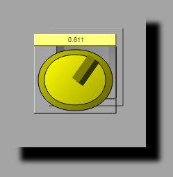
- If you want to add a drop shadow to the dialog, select the Drop Shadow check box.
Note: This setting is only valid for the Empty Frame dialog type.
Here is an example.
- Click OK.
- Double-click the Kiosk2GoDlg block to open it.
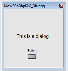
- Add Generic Controls to your design page, and then copy and paste them over to the dialog.
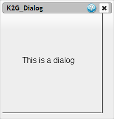
In the example below, a label and a button have been added. For more information, see Adding controls to the Kiosk2Go Layout device.
To open the dialog from a button
- Add a boolean generic control to your design page.
- Open a Kiosk2Go device and copy and paste the button from inside the generic control onto one of the pages.
- Display the button control properties.
- On the Type tab, under Popup Dialog, select the Enable Dialog Popup check box.
- In the Dialog list, click the name of the dialog you want to link to the button.
- Click OK.
When the user taps the button in a browser, the dialog will be displayed.