|
|
|
Control |
Enhanced Touch mode |
NWare Compatible mode |
Previous page and next page
|
Click/tap to change to the next or previous page. |
|
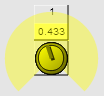
Knob control
|
Click/tap the center of the knob to change to gesture mode. A colored gesture area will be displayed around the knob control.
Drag inside this area to gesture the knob and change its value. Click/tap the center of the knob to exit gesture mode. |
Click/tap/hold the center of the knob to change to gesture mode. Drag vertically or horizontally to gesture the knob and change its value.
|
Click/tap the value box to specify a new value. If you are using a PC, you can double-click the value box to edit the current value. |
||
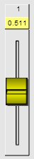
Fader control
|
Drag the fader handle to change the value. Click/tap the value box to specify a new value. If you are using a PC, you can double-click the value box to edit the current value. If you are using a touch device, you can drag multiple faders at the same time.
|
|
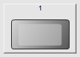
Button control
|
Click/tap to operate. A button can be a toggle button (staying down or up when you gesture it) or a momentary button (staying in the down state only momentarily). |
|
Help
|
Click/tap the button to change to help mode Click/tap a control to display the context sensitive help. Click/tap the Help button again to switch back to gesture mode. |
|


 . You will not be able to gesture controls.