|
|
|
A Kiosk2Go Layout device stores the pages that will be displayed in your mobile device browser or PC browser.
There are lots of individual smartphone layouts and tablet layouts under Graphic Elements & Blocks / Kiosk2Go Layouts in the device tree. Each is preset with the screen dimensions of the particular device after which it is named. When you drag the device over to the design page and create it, you will be able to see exactly how much screen space you have available for buttons, sliders and other controls.
When you add a Kiosk2Go Layout device to your design, you assign it a page group name. By default, this is the name of the device, e.g. HTC Thunderbolt. Once you have set up the device, you grant the user, who will log on to Kiosk2Go in the browser, access to this group. If you add several Kiosk2Go Layout devices to the project, provided they have been granted access to the page groups, the user will be asked to choose a page group name before they can access the pages it contains.
To add a Kiosk2Go Layout device
If the device you are using is not listed, drag a Generic device over to the design page.
The Kiosk2Go Layout Properties dialog box is displayed.
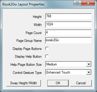
The screen design area is the part of the Kiosk2Go device visible on the screen when Kiosk2Go is running.
Tip: Specifying a height that is larger than the height of the device screen will allow the user to scroll down to see more controls on the page.
This name will be displayed as the title at the top of the browser screen running Kiosk2Go.
Tip: The help text is specified for each individual control on the Control Properties / Help tab.
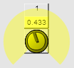
Enhanced Touch |
Click/tap the center of the knob to change to gesture mode. A colored gesture area will be displayed around the knob control.
Drag inside this area to gesture the knob and change its value. Click/tap the center of the knob to exit gesture mode. |
NWare Compatible |
Similar to the style used in regular Kiosk. Tap/hold the center of the knob and then drag to gesture.
|
Auto Select |
A mode will be selected automatically, based on the type of device running Kiosk2Go. |