|
|
|
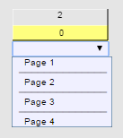
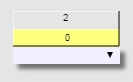
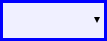
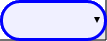
By default, a combo box, which is used to present a list of options, looks like this in a browser:
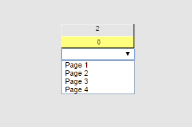
The style of the control is very similar to the combo box shown in NWare and Kiosk.
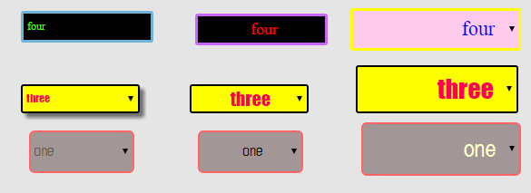
NWare allows you to customize the appearance of the combo box to help it conform to the design of your Kiosk2Go project. You can change a number of different attributes, including the font name and size, background color and border color. Below are some examples.
To customize the appearance of a combo box
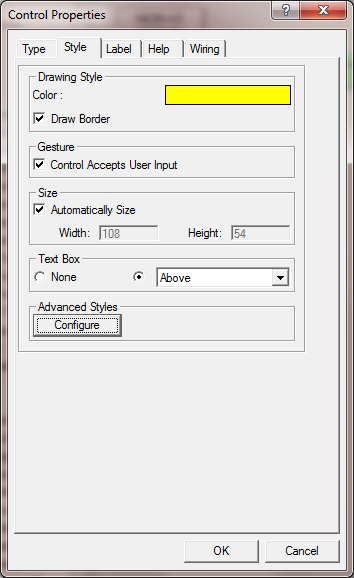
The Advanced Style: combo box dialog box is displayed.
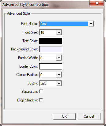
Font Name |
The name of the font used to render the items in the combo box list. |
||
Font Size |
The size in points of the font used to render the items in the combo box list. |
||
Text Color |
The color of the text shown in the combo box list. |
||
Background Color |
The color shown behind the combo box. The same color is shown behind the list when it is open or closed. |
||
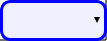
Border Width |
The width of the border around the edge of the combo box when it is closed. |
||
Border Color |
The color of the border around the edge of the combo box when it is closed. |
||
Corner Radius |
The radius of the curve of the border displayed around the edge of the combo box. A larger number produces a rounder look for the corners. A smaller number produces a sharper look. Some examples are shown below. |
||
0 |
10 |
20 |
|
|
|
|
|
Justify |
Specifies the alignment for the list entries: Left, Center or Right. |
||
Separators |
When selected, horizontal lines are shown between each of the options in the list.
|
||
Drop Shadow |
When selected, adds a drop shadow to the combo box.
|
||
|
See also |