|
|
|
Drawing Style |
|||
Color |
The color of the control when it is switched on. Click the color sample, then choose a color from the color palette. |
||
Draw Border |
Draws a raised border around the control. |
||
Gesture |
|||
Control Accepts User Input |
Allows the user to change the value of the control by gesturing it with the mouse, or hovering over the control and typing a value. |
||
Size |
|||
Automatically Size |
The control will be drawn at its default size. |
||
Width |
The width of the control in pixels. |
||
Height |
The height of the control in pixels. |
||
Text Box |
|||
None |
Hides the text box on the control. |
||
(Position) |
Displays a text box on the control at the specified position. |
||
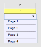
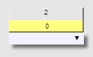
Advanced Styles (For combo box controls. Available via the Configure button.) |
|||
Font Name |
The name of the font used to render the items in the combo box list. |
||
Font Size |
The size in points of the font used to render the items in the combo box list. |
||
Text Color |
The color of the text shown in the combo box list. |
||
Background Color |
The color shown behind the combo box. The same color is shown behind the list when it is open or closed. |
||
Border Width |
The width of the border around the edge of the combo box when it is closed. |
||
Border Color |
The color of the border around the edge of the combo box when it is closed. |
||
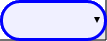
Corner Radius |
The radius of the curve of the border displayed around the edge of the combo box. A larger number produces a rounder look for the corners. A smaller number produces a sharper look. Some examples are shown below. |
||
0 |
10 |
20 |
|
|
|
|
|
Justify |
Specifies the alignment for the list entries: Left, Center or Right. |
||
Separators |
When selected, horizontal lines are shown between each of the options in the list.
|
||
Drop Shadow |
When selected, adds a drop shadow to the combo box.
|
||
|
See also |